Hi there! My name is
Jennifer Mitchell
(but you can call me Jen)
I’m an aspiring UX researcher with a background in psychology, cognitive science, and human factors. I specialize in qualitative and quantitative research to uncover insights that improve how people experience and interact with technology. My work explores areas like emotion, decision-making, and human-AI interactions, with a focus on designing solutions that are inclusive and meaningful.... and this is my UX research portfolio.
About Jen
I’m Jennifer Jaehee Mitchell, an aspiring UX researcher with a global upbringing and a deep passion for understanding how people connect - with each other and with technology. Growing up in a military family meant I moved to seven different places before I turned 17, including Japan, Korea, Germany, and across the U.S. Each move shaped my curiosity about how people communicate and form relationships in diverse contexts.I earned dual bachelor’s degrees in Cognitive Science and Psychology from the University of Virginia, exploring how people think, feel, and make decisions. Now pursuing a graduate degree in Human Factors Engineering at Virginia Tech (graduating May 2025), I focus on the intersection of human behavior, design, and technology.My research has covered topics like emotion, attachment, and decision-making, with a special focus on how people interact with artificial beings (yes, robots). I’ve also worked closely with autistic populations, gaining valuable insights into diverse cognitive and emotional experiences. I’m especially passionate about using user-centered methods to improve interactions with technology—whether it’s designing intuitive interfaces, fostering trust in AI, or enhancing accessibility for neurodiverse users. My goal is to create solutions that empower users, humanize technology, and ensure inclusivity.Outside of work and school, I’m a mix of creative chaos and calm curiosity. I love doodling in the margins of my notebooks, journaling my way through ideas, reading books that make me think, and leveling up in video games (bonus points if cats are involved in the game or IRL). Speaking of cats, my furry companions are my ultimate co-researchers—they just haven’t mastered the keyboard yet.I believe great UX starts with empathy and understanding, and I’m passionate about designing experiences that empower, inspire, and connect.
Projects

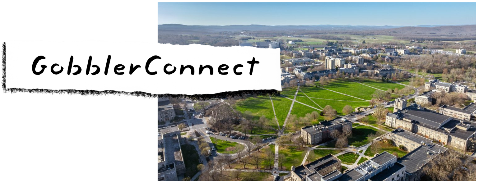
A New Interface for VT's Student Engagement and Campus Life

A New Interface for Virginia Tech's
Student Engagement and Campus Life

A Mentorship Application for Autistic STEM Students
A STEM Mentorship Application
for Autistic Undergraduate Students

An Application for Collaborative and Social Home Cooking Experiences

An Application for Collaborative and
Social Home Cooking Experiences

Please contact me to work on other projects together!!
Résumé and Other Work
Resume and CV

Awards and Publications
STEM Mentorship
This project is currently under embargo and will be publicly released soon. I am happy to provide more information about it upon request!
The Problem
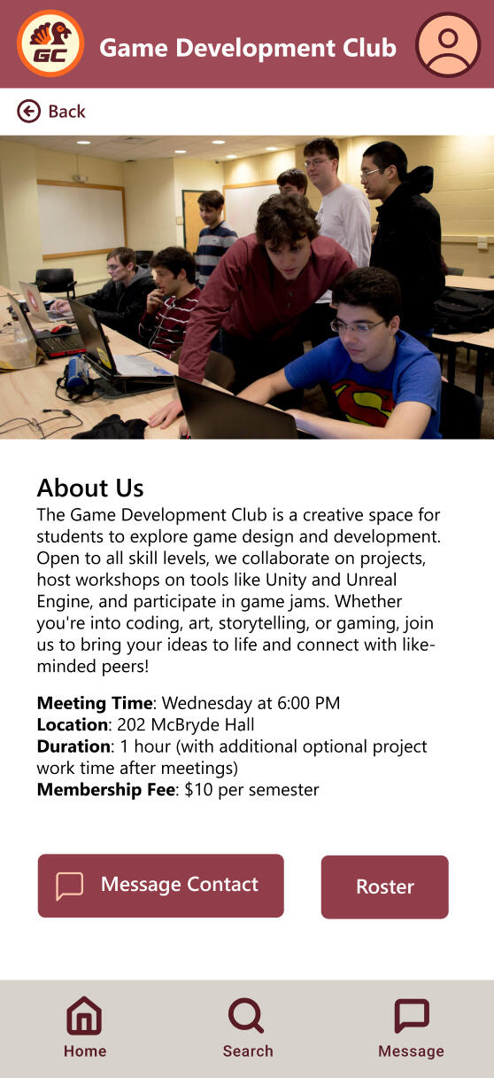
GobblerConnect faced major usability challenges, including fragmented communication, inefficient search tools, and overly complex workflows for event and membership management. These issues caused low engagement, frustration among users, and frequent reliance on external platforms, undermining its role as a central hub for campus life.
The Solution
We envision the updated GobblerConnect as a mobile-first platform designed to address these issues. With integrated real-time communication, enhanced search capabilities, and streamlined workflows, it simplifies event promotion, member management, and administrative tasks. The result is a more intuitive and engaging experience that reconnects users with campus life.
Client
Virginia Tech Student Engagement and Campus Life
Tools
Miro
Figma
Adobe Photoshop
Role
Lead UX Researcher, UX/UI Designer
Process
Research
Data Modelling
Ideation
Design
Evaluation
Research
To address the usability challenges of GobblerConnect, the UX team conducted a detailed contextual inquiry to observe real-world user behaviors and identify pain points.
Understanding the Task
Our exploration began with an in-depth review of GobblerConnect’s features and functionality. This initial assessment allowed us to pinpoint key tasks users performed and identify areas where the platform fell short.We conducted 8 semi-structured interviews and real-time observations.
During these sessions, users shared their screens and performed key tasks, such as searching for events or managing club rosters. Observing their interactions allowed us to capture authentic workflows, challenges, and workarounds.
Affinity Diagramming

We created a Work Activity Affinity Diagram (WAAD) which grouped user actions, challenges, and needs into meaningful clusters.
This analysis revealed key pain points for users, including:

Fragmented CommunicationUsers frequently turned to external platforms (e.g., Discord, email) due to the lack of integrated messaging within GobblerConnect.
Connecting with other [organization] members is hard through GobblerconnectThe platform doesn't offer an easy way to communicate.

Inefficient Search FunctionsOverly broad search filters and a cluttered interface made it difficult for users to find relevant events or organizations.
Events and clubs are not really well organized.Filter categories in the event or organization search is too general.

Low Engagement and UnderutilizationUsers struggled to navigate the platform, resulting in disengagement.
There's no good notification system, so I miss events.The [organizations] I joined don't use GobblerConnect
Data Modelling
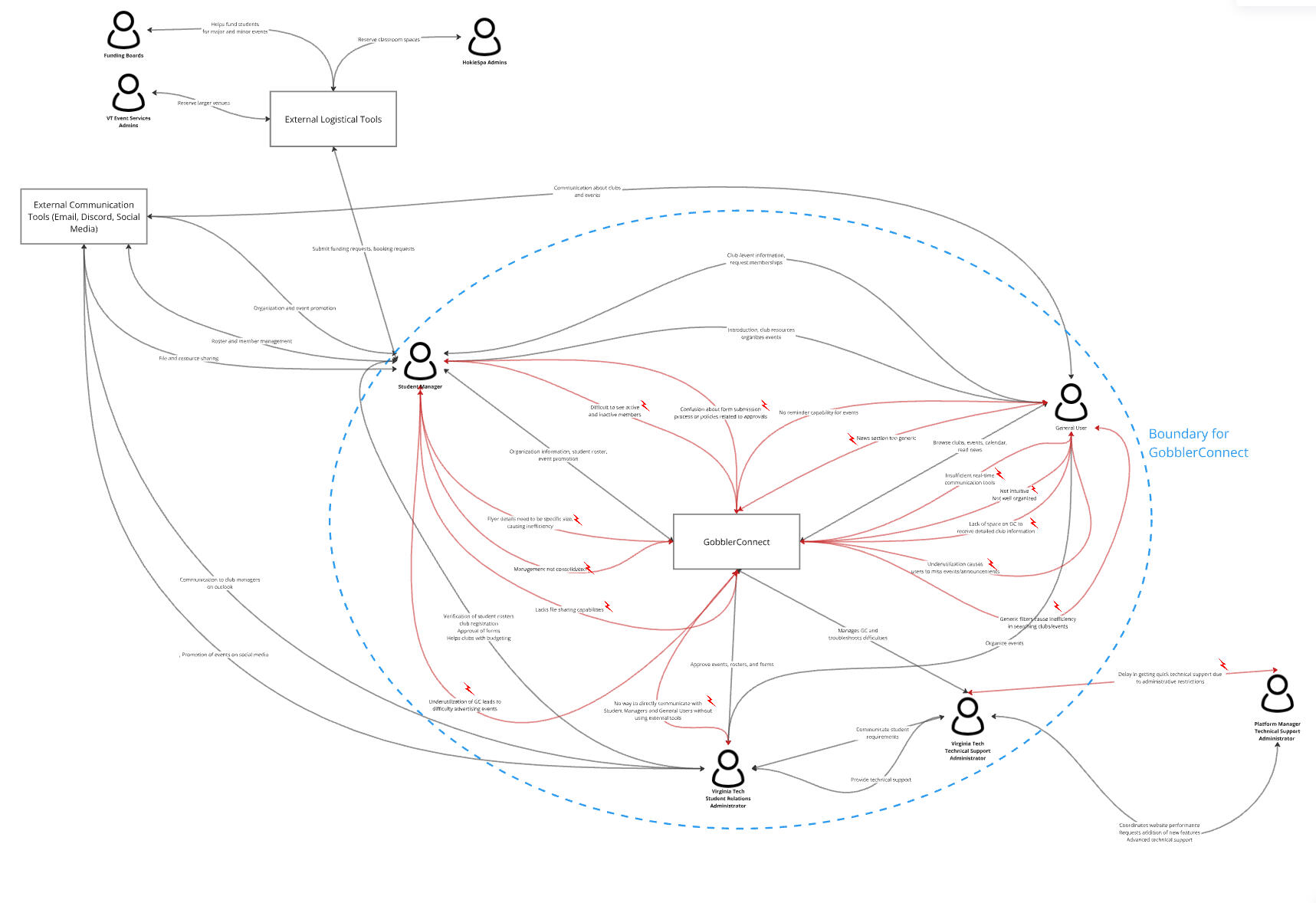
To understand user interactions with GobblerConnect, we created structured models that captured workflows, tasks, and barriers across different user roles. These models provided a framework for identifying inefficiencies and informing the design of the platform.
User Models
We segmented users into distinct work roles to highlight their unique responsibilities, tasks, and challenges:
| General Users | Student Managers | Administrators |
|---|---|---|
| Users finding events/clubs to stay updated on campus activities. | Leaders responsible for event organization, roster updates, and club communication. | Stakeholders managing event approvals and platform maintenance. |
Given the scope of the project and our client’s goals, we prioritized general users to address GobblerConnect's largest barrier: underutilization.
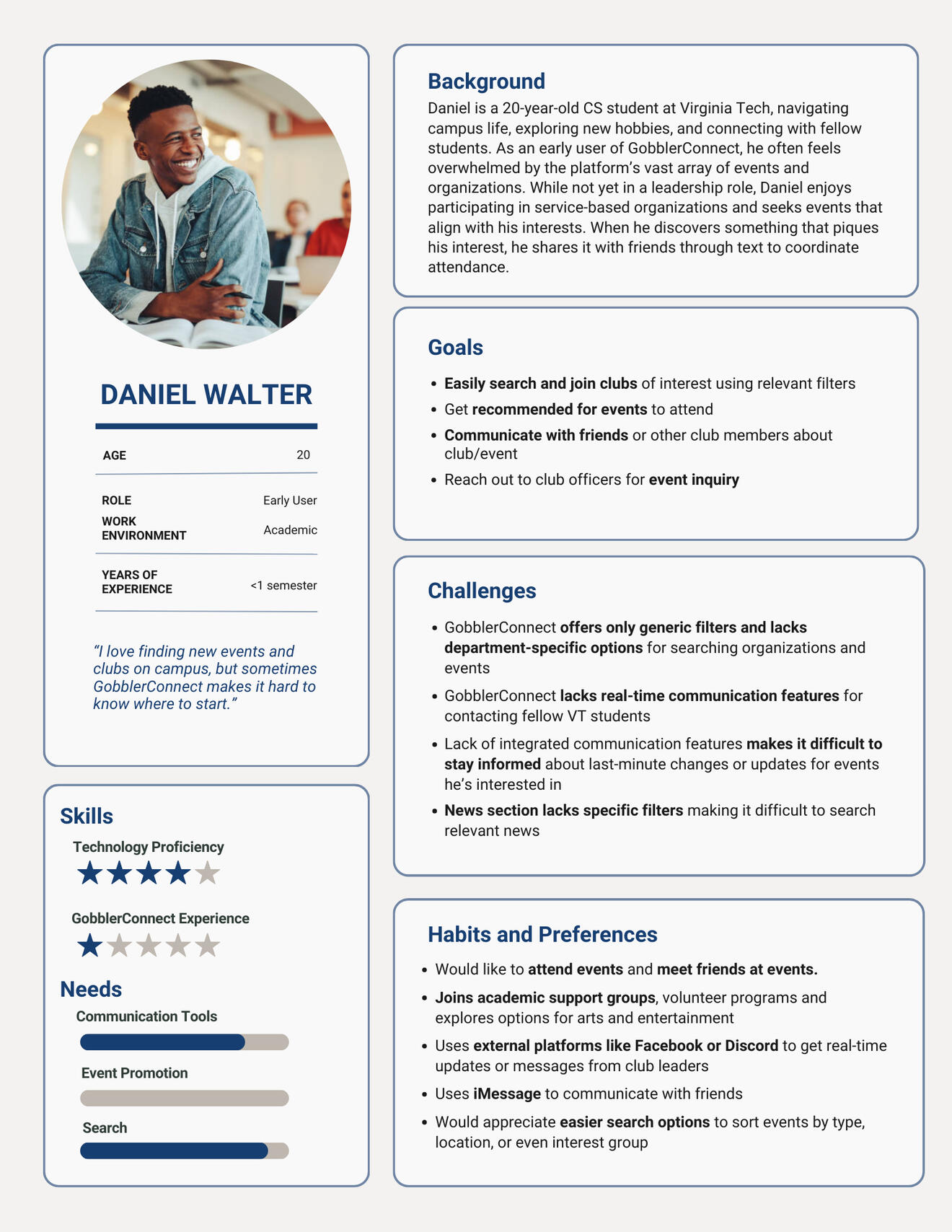
Persona
To humanize this focus, we developed Daniel Walter, a 20-year-old Computer Science student and an inexperienced user of GobblerConnect.
Usage Model
We created a flow model to visualize the exchange of tasks, information, and tools between users. This highlighted significant barriers in fragmentation of work flows and overreliance on external platforms.
Task Models
We developed several task models, both showing the task structure and task sequence to break down user actions.
Hierarchical Task Inventory
The HTI of the general users detailed the structure for tasks such as discovering events, joining clubs, and browsing campus news, breaking these down into subtasks
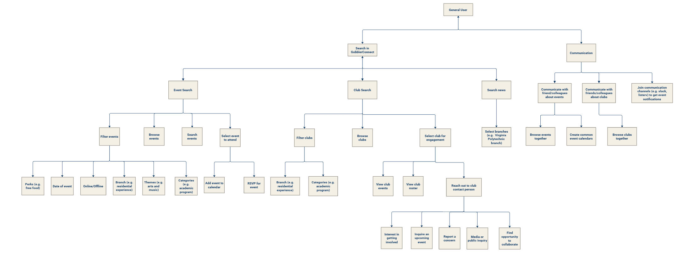
Task Sequence Models
Step-by-step task sequence models and usage scenarios were created to map out how users interact with the platform, highlighting key tasks such as searching for events, RSVPing, and communicating with club members. These models revealed inefficiencies and pain points, such as unclear navigation paths and reliance on external tools, which informed our design priorities.
Usage Scenario
Task: Communicating with friends about a potential event of interest
Shreya, a graduate student at Virginia Tech, is eager to pursue her passion for dance outside of her academic schedule. One day after class, she decides to search for dance-related activities on the GobblerConnect website. Hoping to find a organization or event that fits her interests, she navigates to the ‘Event’ tab and opens the categories drop-down menu. She quickly locates and selects the ‘Dance Workshop/Training’ category, which shows a few upcoming events. One event catches her eye, and she’s excited to attend, but she wants to check with her friends to see if they’re interested in joining her.Unfortunately, GobblerConnect lacks any built-in communication features, which means she can’t easily share the event with her friends directly from the platform. To work around this, Shreya takes a screenshot of the event details and shares it with her friends through their WhatsApp group. Her friend Alia responds quickly, saying she’s interested in attending, but they still need to ask their other friend, Krish, who isn’t part of their WhatsApp group. This makes Shreya realize how much easier it would be if GobblerConnect had a communication channel where students could seamlessly share event details and chat with each other directly on the platform.Despite the slight inconvenience, Shreya and Alia both RSVP to the event and mark it on their calendars, excited for the upcoming dance workshop. However, Shreya can’t help but think that GobblerConnect could significantly improve the user experience by integrating a way for students to communicate and coordinate with each other right within the platform.
Step-by-Step TSM
Task: Finding event for a given date and category on GobblerConnect
| Student User | GobblerConnect |
|---|---|
| 1. Visits GobblerConnect website to search potential events to attend for this weekend | 3. Website provides a list of high-level filters (e.g., Dates, Categories) |
| 2. Navigates to the ‘Events’ Tab | 5. Website shows a long list of events scheduled for this weekend |
| 4. Under ‘Dates’ filter, selects ‘This weekend’ | 5. Website shows a long list of events scheduled for this weekend |
| Barrier 🚩: Difficult to choose from a long list of events | |
| 6. Website consists of additional filters ‘Themes’ and ‘Categories’ | 7. Both themes and categories section consist of ‘Service’ option |
| Barrier 🚩: Difficult to differentiate between these two filters as they contain same options | |
| 8. Selects ‘Community Service’ option from ‘Categories’ section | 9. Website shows two events |
| 10. Selects an event named ‘ESA for Sundae Bar’ | 11. Date, time, location, host organization name are displayed |
| 12. Student looks for contact person of the event to ask a query | 13. Website doesn’t show a contact person of the event |
| Barrier 🚩: Not finding a contact person makes student uncertain about attending the event | |
| 14. Decides to look for other events specific to their department | 16. Website provides a long list of academic events from all the departments |
| Barrier 🚩: GobblerConnect lacks department-specific filters | |
| 17. Nevertheless, after scrolling for some time, RSVPs for an event and adds it to their calendar | |
The insights gathered from our data modeling process directly informed our ideation and design phases by identifying key areas for improvement.
Ideation
In the ideation phase, our team revisited the barriers and frustrations identified during the research phase. To address these challenges, we held collaborative brainstorming sessions and generated ideas for features that could directly enhance the user experience.
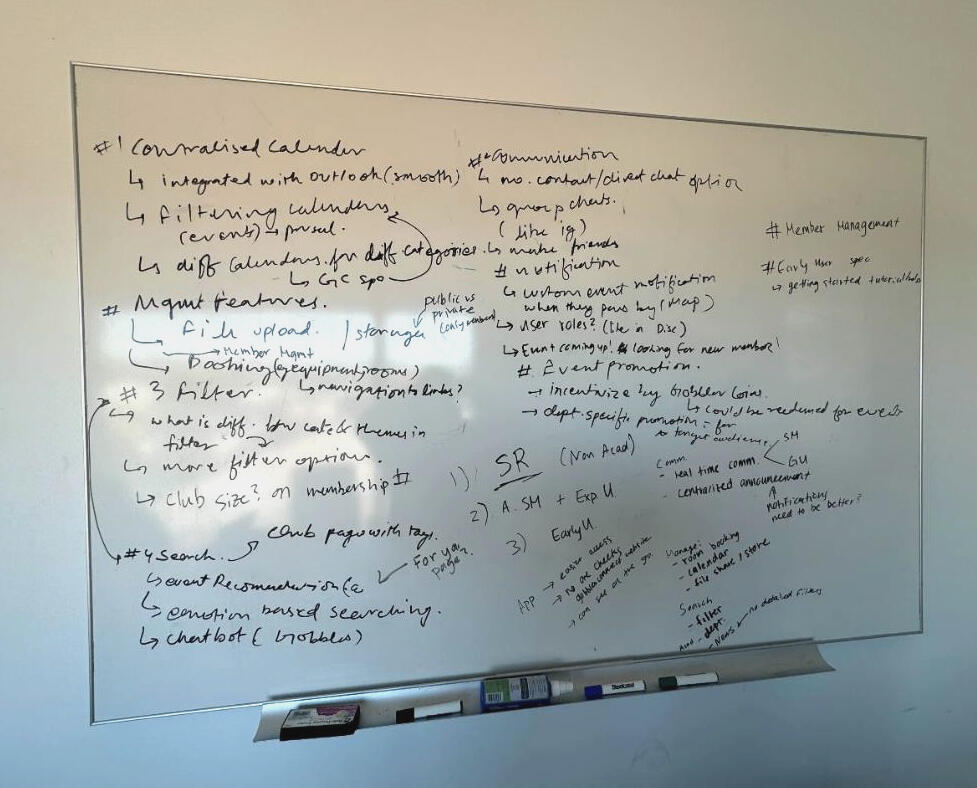
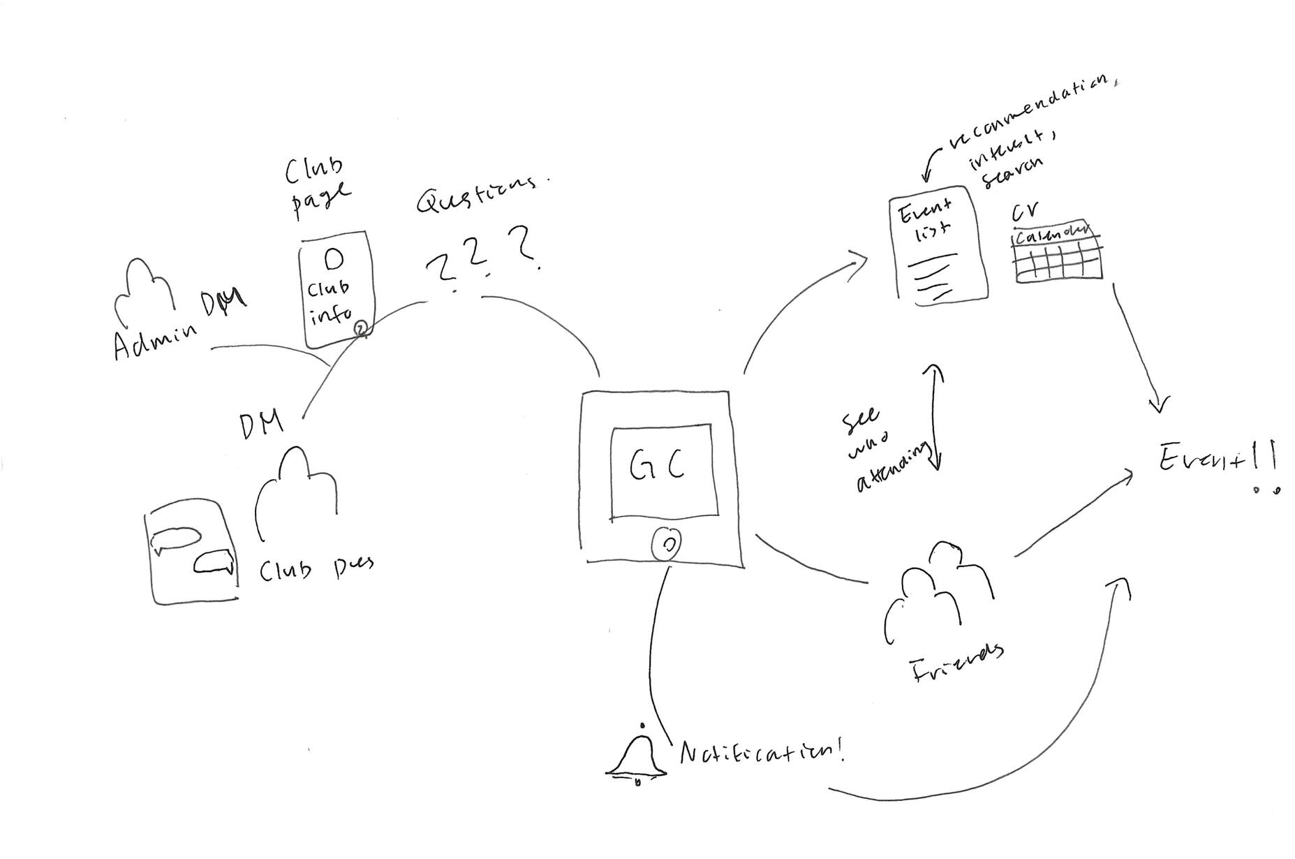
Through our brainstorming sessions, we identified three key features designed to empower general users and address their needs effectively. Our vision was to create a new interface that felt like an all-in-one campus marketplace or town square—a central hub where users could effortlessly connect, explore shared interests, and actively engage with the campus community.
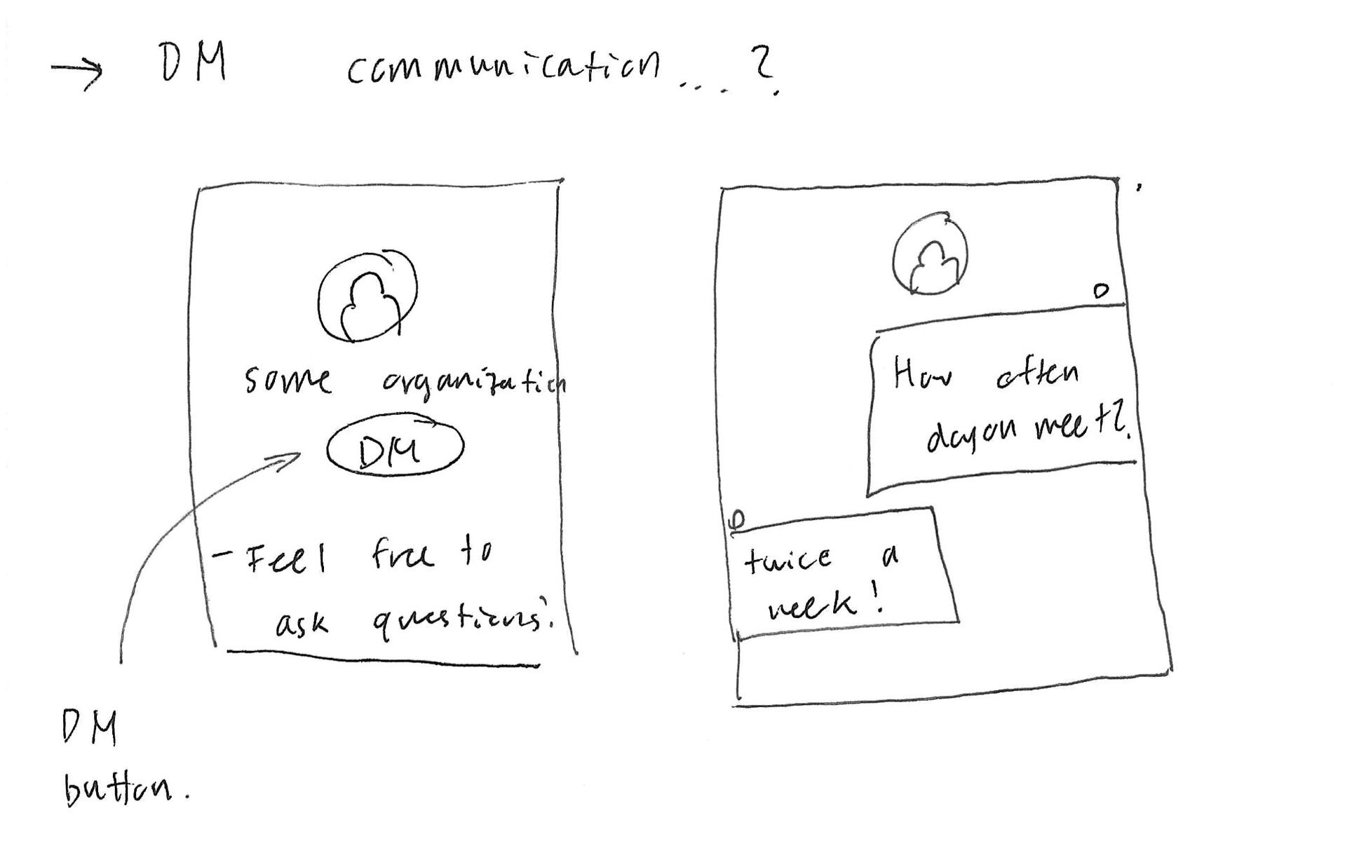
Communication and Connectedness
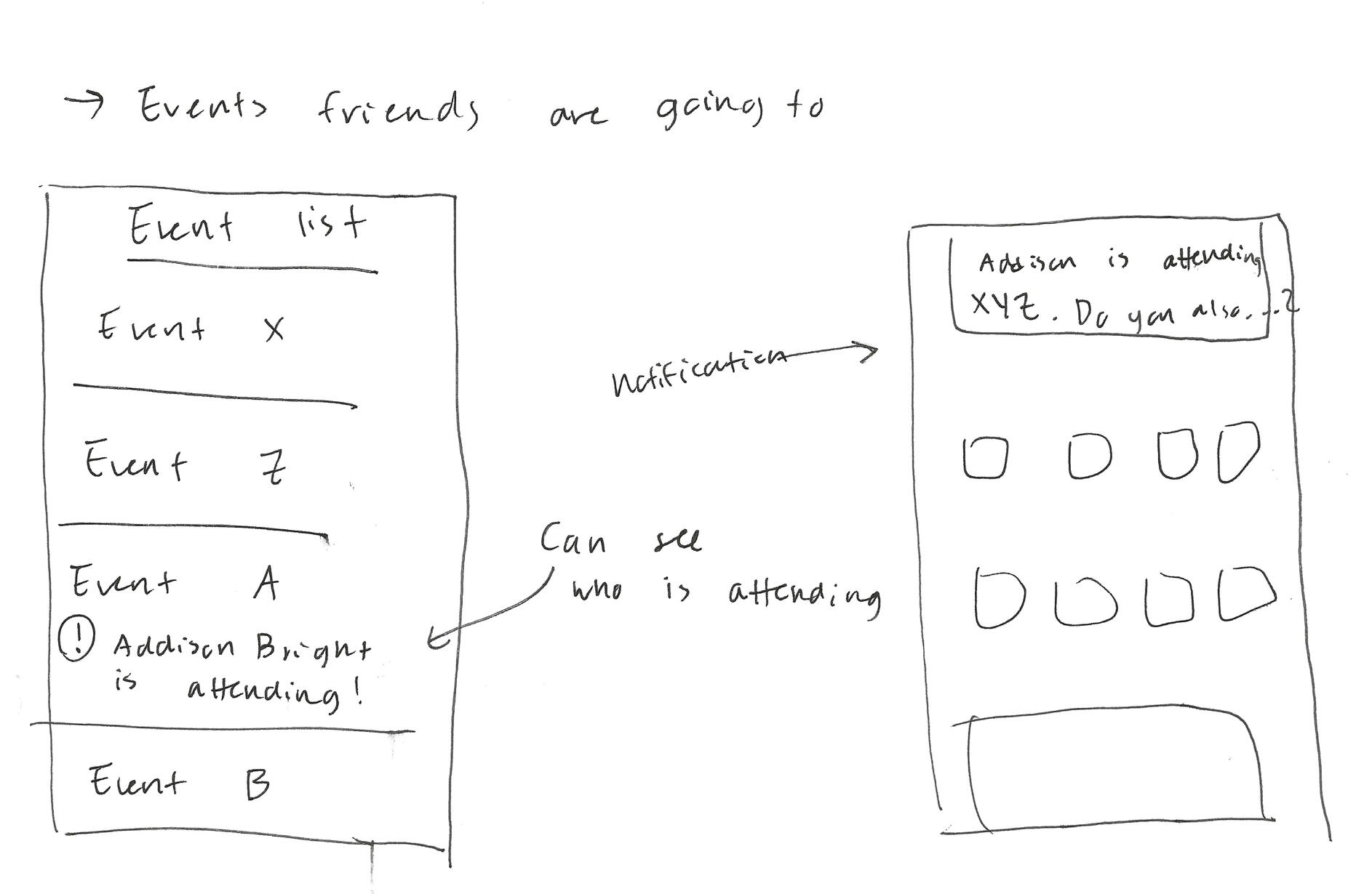
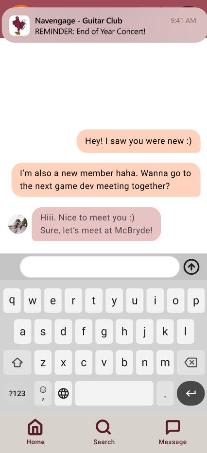
Proposed a direct messaging system within the platform to enable real-time communication between users, club officers, and administrators, reducing dependency on external tools.
Enhanced Search Functionality
Reimagined search with advanced filters, including customizable categories and relevance-based sorting, to make discovering events and organizations more intuitive.
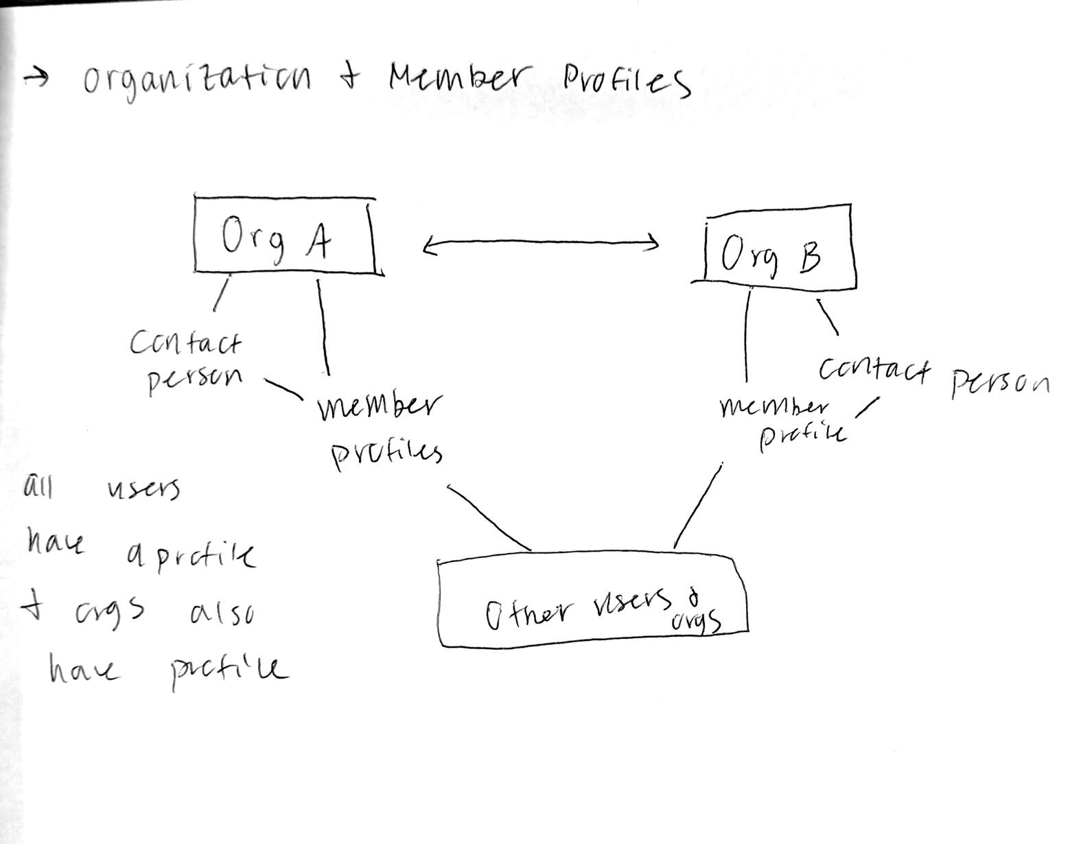
Member Interaction
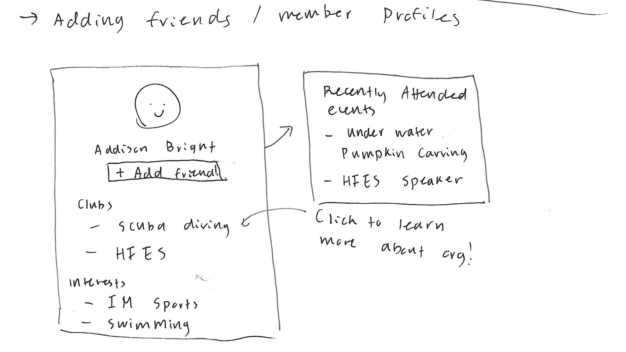
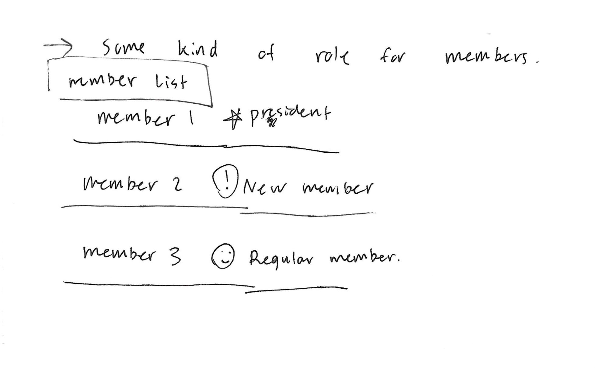
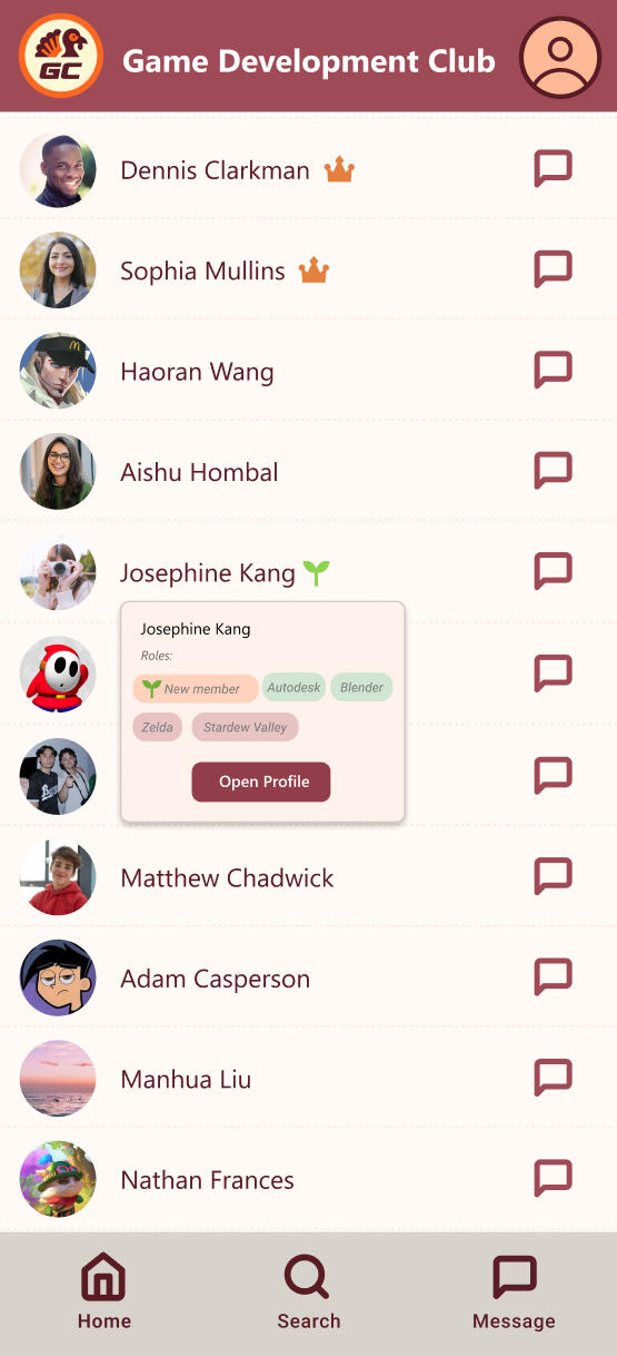
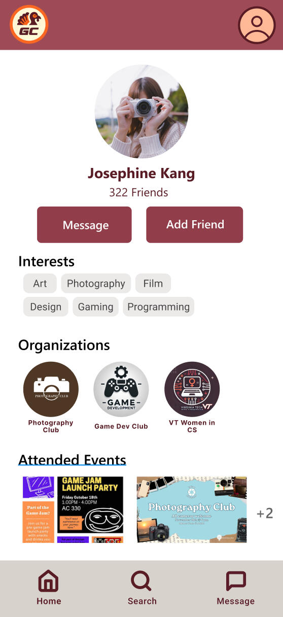
Designed role-based rosters to increase transparency and inclusivity, allowing users to easily identify leaders and new members within organizations.
To address the issue of underutilization, we introduced the idea reward points system (called GobblerCoins) designed to incentivize students to attend events more frequently and actively engage with the platform.
Storyboards
To bring these ideas to life and visualize how they would enhance user experiences, we created storyboards that illustrated the proposed features in action. The following storyboard illustrates the envisioned platform’s features, highlighting how students can discover shared interests, explore mutual connections, and expand their social networks.
Early Concepts and Sketches
We then moved into the early sketching phase to refine and visualize our ideas in greater detail. These sketches explored the layout, interactions, and overall user flow for the proposed features, ensuring alignment with user needs and addressing key pain points identified during research. The sketches below showcase concepts developed specifically for enhancing communication and connectedness within the platform.
Design
This phase focused on creating wireframes and prototypes for the new platform, ensuring the features aligned with user needs and addressed the key pain points identified earlier.
Wireframes
We started with low-fidelity wireframes in Figma to map out the platform’s structure and user flows.
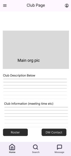
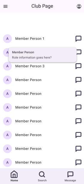


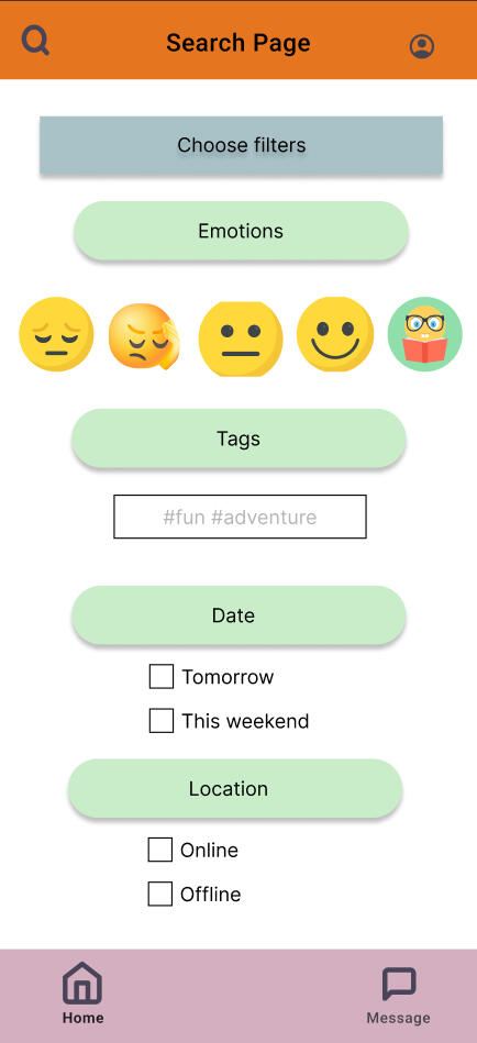
Through iterative refinement, these evolved into high-fidelity wireframes, incorporating features like integrated communication and advanced search. This process ensured the design was ready for evaluation and usability testing.


The Figma prototype can be found at the following link:
Evaluation
Benchmark Tasks
To guide the evaluation process, we defined benchmark tasks reflecting key user interactions with the platform. These included:1. Searching for a specific event
2. Searching for a specific organization
3. Connecting with members of an organization
4. RSVPing to an event
5. Redeem reward points
We conducted an empirical evaluation to gather qualitative feedback from 8 different users, focusing on their experiences with the redesigned platform. Each participant performed the benchmark tasks using a think-aloud protocol, where they verbalized their thoughts, frustrations, and impressions while navigating the system. This method provided valuable insights into their decision-making processes and immediate reactions to the interface. We achieved a 100% task success rate on benchmark tasks while reducing average user errors per task from 1.19 to 0.5.After completing the tasks, we conducted semi-structured interviews to gather more detailed feedback. These interviews allowed participants to reflect on their experiences, discuss challenges they encountered, and suggest potential improvements.
To measure usability improvements, we conducted System Usability Scale (SUS) evaluations before and after the redesign.Pre-Redesign: The original platform had an SUS score of 58, indicating below-average usability, with issues in navigation, search, and communication.
Post-Redesign: The new platform scored 80, a 20+ point increase, placing it in the good-to-excellent range.This improvement reflects a more intuitive interface, streamlined workflows, and enhanced engagement, validating our user-centered design approach.
Problem-Importance Table
The Problem-Importance Table summarizes the key usability issues identified during user testing, along with their prioritization and proposed solutions. This table highlights the challenges users faced and the actionable steps to address them.
| Problem | Importance | Solution |
|---|---|---|
| User wanted to select more than 1 tag when searching | M | Have ability to select multiple tags, with each tag being separated by a comma |
| User was confused on whether or not they have joined a club | M | Add button to request to join club. This could be further developed when designing for the Student Manager POV of the Navengage application |
| Gobbler Coin economy and incentivizing was confusing and unclear. Can't tell how many Gobbler Coins I could get for what. Didn't know what tasks I could earn coins for | M | In current iteration, GCs will be given when registering for an event. In future iterations, GCs can be earned when attending an event - which requires a separate workflow that is TBD. |
| How to search for people without being in the same organization? No member search option | M | Add an option to search for people in Navengage |
| Didn't know what the sprout icon/new member icon was at first glance, but then understood it | 5 | Add a help page in the final prototype |
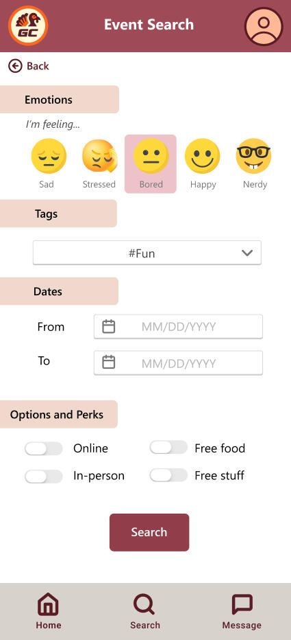
| Filter saying "offline" was confusing when referring to in-person event | 3 | Rename "offline" to "in-person" |
| User wanted more information on the events in the home page | 2 | Limitation of our prototype, actual application will have more detailed event info when clicking an event. |
| Emotion based filters should be for current events only | 1 | Emotion based search will recommend more recent events |
Actionable changes were implemented based on these findings, and the finalized design, along with all research insights, was handed off to the client for further development and deployment.
Takeaways
This was my first full official UX research project, marking a pivotal moment in my journey as a UX researcher. It allowed me to lead the research process from start to finish, applying various methodologies to uncover user needs and translate them into actionable insights for design.The biggest takeaways and reflections from this project include:
The Value of Qualitative DataThrough think-aloud sessions and interviews, I discovered how powerful qualitative research can be in understanding the "why" behind user behaviors. This approach provided rich, actionable insights that would have been missed with quantitative methods alone, enabling designs that truly address user needs.
Narrowing Down ScopeOne of the most valuable lessons from this project was learning how to narrow down scope in an open-ended context. GobblerConnect presented numerous challenges, and it wasn’t immediately clear which issues were the most important. Prioritizing problems that had the greatest impact on UX taught me how to focus research efforts and deliver meaningful, actionable solutions.
Conducting End-to-End ResearchManaging the entire research process, from identifying goals to synthesizing findings, gave me hands-on experience in driving a project from start to finish. It was truly rewarding to work on this project, as it not only deepened my understanding of user-centered research but also strengthened my ability to translate insights into meaningful solutions.
The Problem
Many people find cooking to be a lonely or tedious task, lacking motivation, time, and skills. While existing cooking apps provide recipes and instructions, they fail to foster real-time collaboration, social engagement, and gamified experiences that could make cooking more enjoyable and rewarding.
The Solution
Through features like live video collaboration, gesture-based controls, and gamification, CookingCrew transforms cooking into a social, fun, and rewarding experience. Users can connect with friends, participate in group cooking challenges, and track their progress together. The platform bridges the gap between functionality and social connection, creating an engaging experience that makes cooking accessible and enjoyable for everyone.
Client
Personal/Academic Project
Tools
Figma
QuestionPro
Adobe Photoshop
Role
Lead UX Researcher, UX/UI Designer
Process
Research
Ideation
Design and Prototype
Evaluation
Research
To address the challenges of making cooking a more engaging and collaborative experience, we conducted a detailed user research study to uncover user pain points, behaviors, and opportunities for improvement.
Understanding User Needs
Our research began with a combination of surveys and semi-structured interviews aimed at understanding how people approach cooking in their daily lives. This phase revealed key insights about user motivations, frustrations, and expectations when it comes to meal preparation.We conducted 5 user interviews and distributed 20 survey questionnaires to gather both qualitative and quantitative insights on user cooking habits and experiences.We synthesized our qualitative findings into an Affinity Diagram to identify recurring themes and categorize user needs into meaningful clusters.
Affinity Diagramming
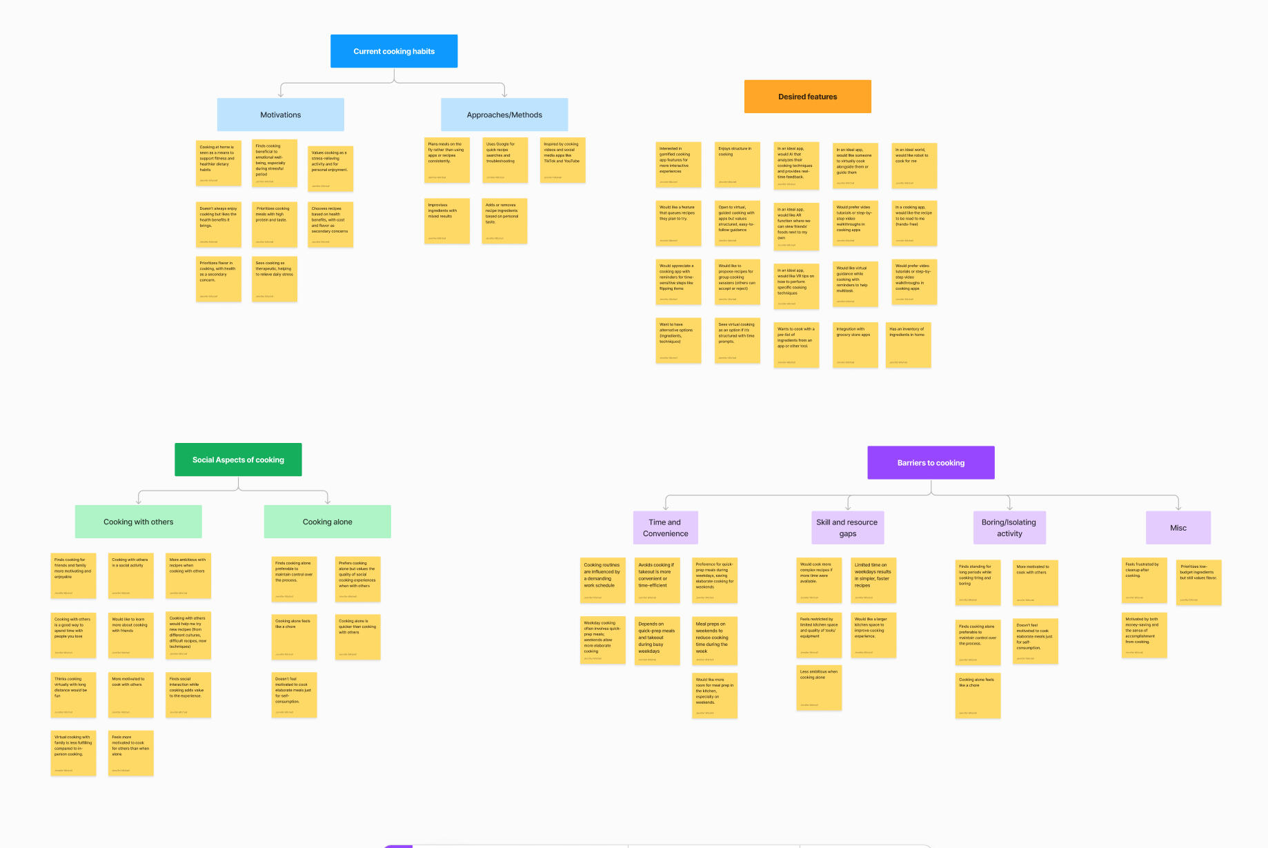
We synthesized our findings into an Affinity Diagram to identify recurring themes and categorize user needs into meaningful clusters. This research revealed two primary insights:
Key Barriers
Time and Convenience: Users struggle to cook regularly due to busy schedules and the effort involved in meal preparation.Skill and Confidence Gaps: Many users feel overwhelmed by complex recipes and lack the confidence to experiment in the kitchen, leading to less diverse meals.Social Isolation: Cooking alone is unmotivating and often seen as a monotonous chore.

Desired Features
Collaboration: A platform for real-time group cooking, share progress, and communicate via chat or video.Gamification: Gamified elements like challenges, rewards, and badges designed to inspire users to cook more frequently and explore new recipes.Personalized Assistance: Step-by-step guided recipes, hands-free functionality, and reminders simplify cooking, while AI or AR/VR tools provide feedback or demonstrate techniquess.
Ideation
Initial Vision and Pivot
CookingCrew was originally conceived as a tool to promote healthier eating habits by encouraging users to cook together. The idea was to leverage collaborative cooking to inspire better dietary practices. However, our user research revealed a deeper issue:People weren’t cooking at all, which led to unhealthy eating habits and a lack of recipe diversity.
Users viewed cooking as a chore, often sticking to the same meals repeatedly.This insight highlighted the need to address the motivation to cook, not just the focus on healthier eating. To address this challenge, we pivoted CookingCrew’s focus:
From Health to Fun:
Instead of framing the app around healthy eating, we reimagined it as a platform that makes cooking enjoyable.
Collaborative Opportunities:
Features to make cooking a shared, interactive experience with friends or family.
Motivational Incentives:
Gamified elements like challenges, rewards, and badges to encourage frequent cooking.
Cooking Assistance:
Tools like guided recipes and support for lower skill levels to reduce the intimidation of cooking.
Learning from Proven Platforms
To design CookingCrew, we looked to successful platforms that foster engagement, habit-building, and community interaction. These platforms informed key strategies for making cooking a fun and collaborative activity:
Duolingo - Forming Habits:
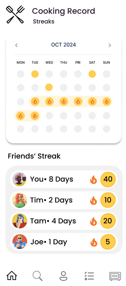
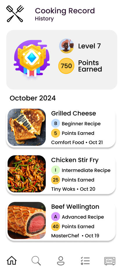
Duolingo's streaks, badges, and rewards encourage consistent engagement with the platform.For CookingCrew, we incorporated similar gamification, introducing "Meal Streaks" for consecutive cooking days and badges for trying new cuisines or techniques.

Twitch - Real Time Interaction:
Twitch creates an interactive community through live-streaming and shared experiences.Inspired by this, we developed features for real-time virtual group cooking sessions where users can connect, share progress, and cook collaboratively.
Peloton - Social Motivation:
Peloton transforms individual workouts into shared challenges, using leaderboards, group goals, and community-driven motivation.For CookingCrew, we integrated group recipe challenges, shared progress tracking, and leaderboards to foster camaraderie and friendly competition.
From these inspirations, we thought of adding a feature to promote both social connection and learning: public and private cooking rooms.Private Rooms: Invite friends or family for close-knit virtual cooking sessions, sharing progress in real-time.Public Rooms: Open to the broader community, these spaces allow users to connect with people worldwide. By joining themed cooking sessions or workshops, users can learn new techniques, explore global cuisines, and share their expertise.
Personas
Our brainstorming and ideation revealed a need for an app that caters to a variety of cooking styles and motivations. To ensure our solutions addressed the unique needs of our audience, we developed detailed personas based on our research.
These personas became our guiding framework, helping us prioritize features and design a user experience that meets the needs of each type of user. With this foundation in place, we moved into the wireframing phase to visualize how the app would function
Design and Prototype
Wireframes
The initial wireframes were created with our personas in mind, focusing on features like collaborative rooms, guided cooking, and gamified challenges. These wireframes set the stage for iterative design and user testing to refine the app further

Prototype
With wireframes finalized, our next step was to test the feasibility of our ideas in a functional environment with a working prototype.
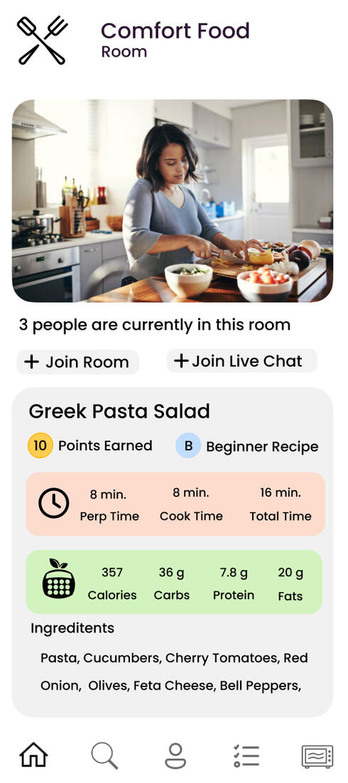
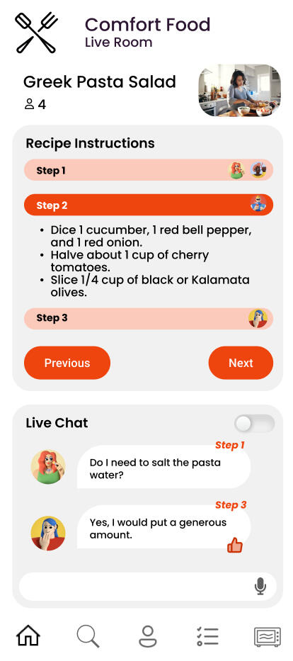
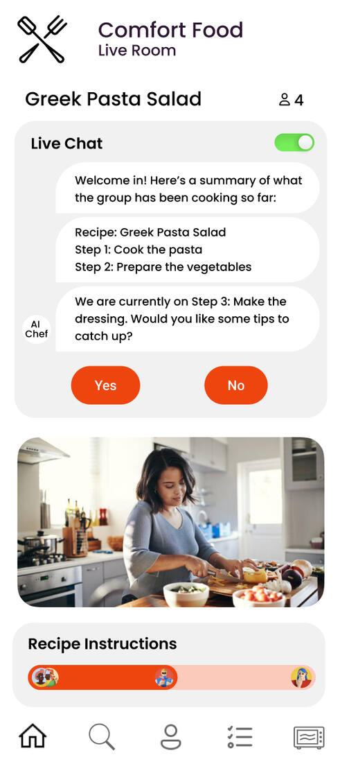
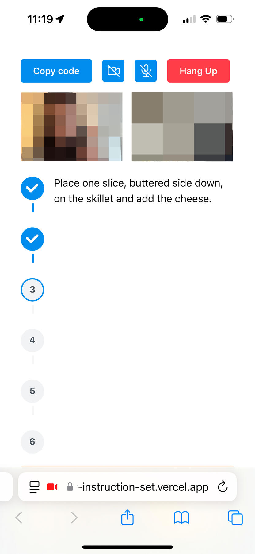
Collaborating with a development team, we created a low-fidelity working prototype. While not visually refined, this prototype focused on testing core functionality, to validate our app's interactive and collaborative features.The following key features were included:
| Two-way video: | Enables real-time interaction and collaboration, addressing social and learning aspects. |
| Step-by-step instructions: | Provides guided support and recipe following for users of various skill levels. |
| Gamification points system: | Encourages continued engagement by rewarding users for completing recipes or challenges. |
| Gesture tracking: | Simplifies the cooking process with hands-free interaction, making it easier for users to follow instructions while multitasking. |
Evaluation
Benchmark Tasks
To guide the evaluation process, we defined benchmark tasks reflecting key user interactions with the platform. These included:1. Joining a cooking room
2. Cooking a recipe (in this case, a simple grilled cheese recipe was followed)
3. Using gesture interactions
3. Gaining achievement points for recipe completion
We conducted an empirical evaluation to gather qualitative feedback from 2 different users. Each participant performed the benchmark tasks using a think-aloud protocol, where they verbalized their thoughts, frustrations, and impressions while navigating the system.After completing the tasks, we conducted semi-structured interviews to gather more detailed feedback. These interviews allowed participants to reflect on their experiences, discuss challenges they encountered, and suggest potential improvements.
User Feedback
User feedback strongly aligned with our initial vision for CookingCrew, particularly emphasizing the desire for enhanced social features. We found two key areas where users wanted to see the app grow:
Support for Large Group CookingUsers expressed strong interest in cooking with larger groups of friends, suggesting a key opportunity to expand the app's social reach.
"I think I would have loved this feature over COVID to reconnect with friends and family""[It] could be really chaotic but in a fun way [with a large group of friends]."
Beyond the KitchenUsers envisioned CookingCrew as more than just a cooking tool, suggesting a need for features that foster social interaction beyond the immediate cooking experience during cooking.
"Having some sort of voting system to get more achievement points could be fun""I think it would be fun to be able to make a collaborative playlist in the app while cooking."
However there were also some limitations for use cases. Users seemed to think they wouldn't use the app for every meal. They suggested it would be better suited for more involved recipes or for cooking with friends as a social activity
"I don’t know if I would use it super frequently if I’m short on time, but I think it’s less scary to try new recipes with someone you know""[I] would probably use it for more difficult recipes rather than cooking a grilled cheese."
Despite the use of a low-fidelity prototype, users reported a positive and engaging experience. This positive reception, even with the limitations of the prototype, demonstrates significant potential for the further development and expansion of the CookingCrew app. Participants expressed that the app could motivate them to try new recipes and build greater confidence in their cooking abilities.
Takeaways
Communication is KeyThis project marked my first experience collaborating closely with a development team. At first, it was a bit of a struggle to understand their constraints and limitations. I quickly realized that open and honest communication was essential to bridge that gap and make sure we were all on the same page.
Staying Flexible and AdaptingThis project truly showed the importance of flexibility and adaptability. The initial research and design goals had to be adjusted based on on user feedback and technical feasibility. Learning to pivot and adapt based on user input was a valuable lesson.
Leading Research on a Blank Canvas is Hard (but Exciting!)One of the biggest challenges was leading research on a product that was essentially just an idea. There was no existing product to analyze or user base to tap into. It required a lot of creative thinking and a deep dive into potential use cases to shape the initial research direction.
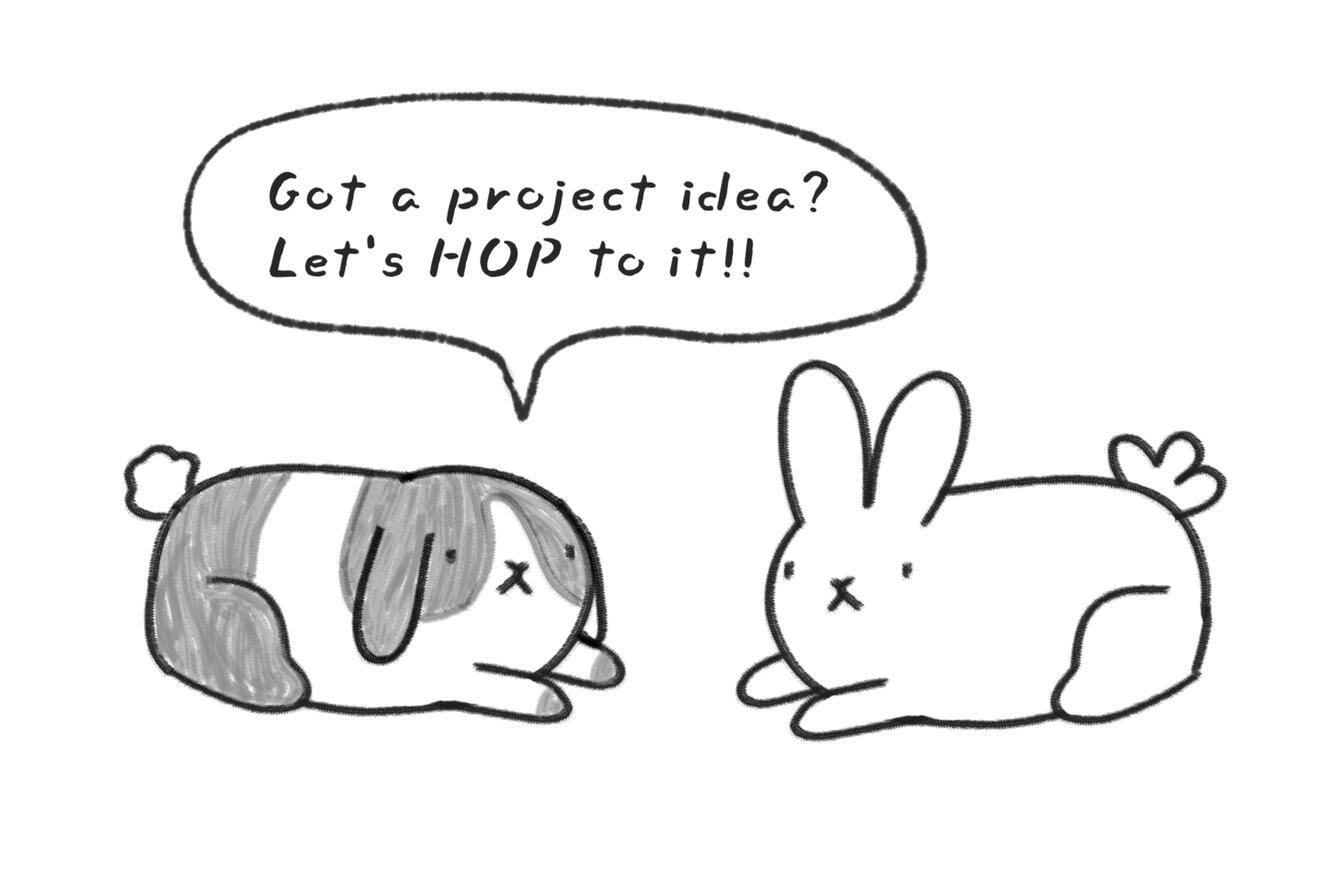
Contact me!
Let’s connect! Whether you have a project idea, need a UX researcher, or just want to chat -- shoot me an email!